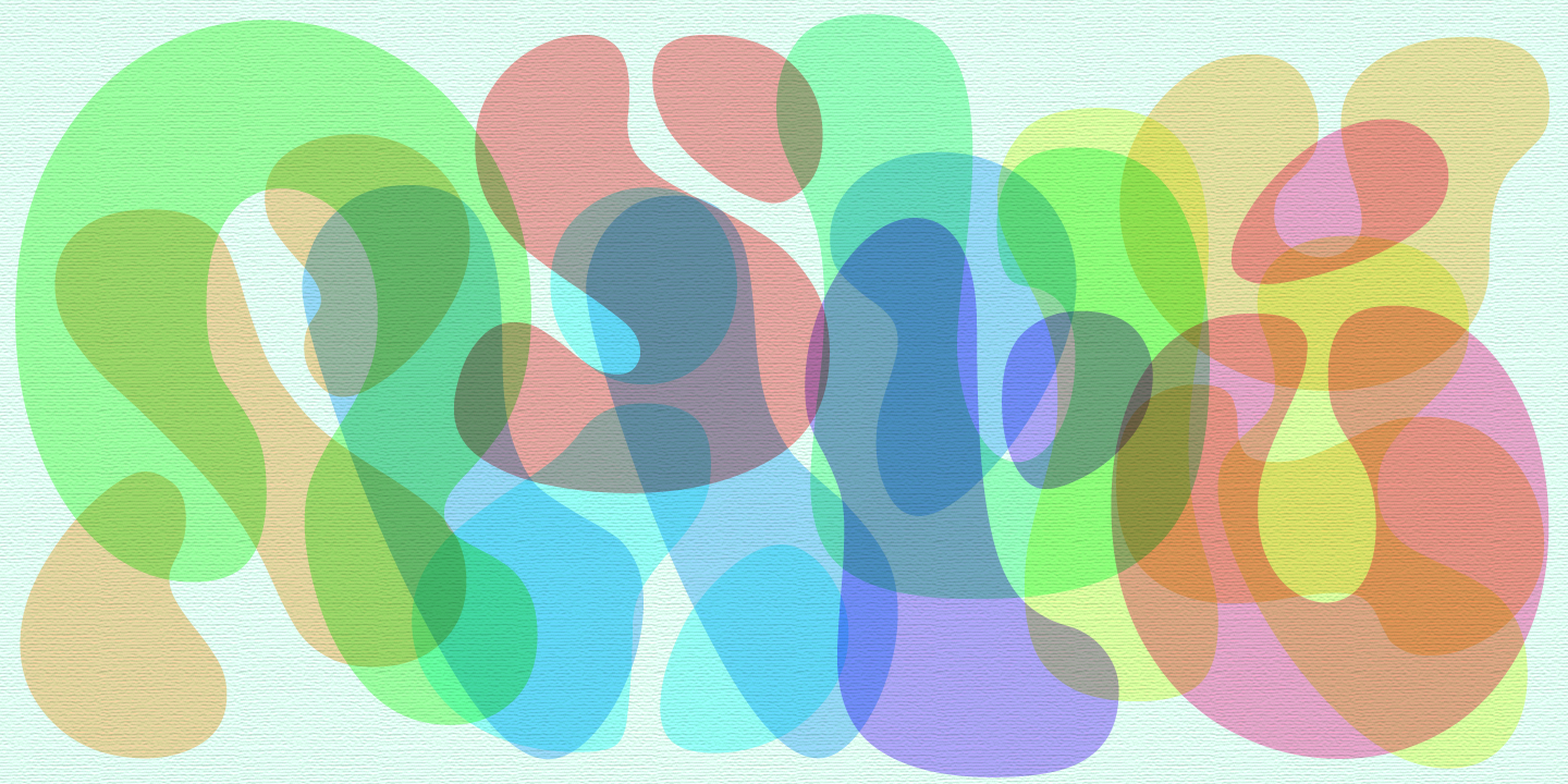
Fillmore was inspired by French Art Nouveau style of the late 1800s, Surrealist art of the early twentieth century, and psychedelic design of the 1960s. Its letters are made up of disjointed and blobby forms, finding inspiration in the brushed letters of poster artists in the Moulin Rouge era and the abstract art of Jean Arp, Joan Miró, and Isamu Noguchi. But these biomorphic forms, with no straight lines in sight, also look they could be bubbling up in a Lava Lamp. Fillmore is evocative of these past eras, yet fresh and inventive.

A design featuring overlapping multicolored letters from the Fillmore typeface
The lighter weights of Fillmore present soft and thin lines and large gaps, just suggestive enough for the eye to read. They have a sparse, hand-painted quality.
A design featuring overlapping multicolored letters from the Fillmore typeface
The bolder weights tighten up the spaces and emphasize the inflated character of the shapes. They can evoke blown-up balloons, amoeba specimens, or psychedelic light shows, and look great large.
A design featuring overlapping multicolored letters from the Fillmore typeface
The Regular strikes a balance on those scores…
A design featuring overlapping multicolored letters from the Fillmore typeface
…and is perhaps unexpectedly suitable for longer stretches of copy. Fillmore’s letters at large sizes are abstract and disjointed, but in running text they are quite fluent and legible.
A design featuring overlapping multicolored letters from the Fillmore typeface
Stylistic alternates for several letters are included in every font.
A design featuring overlapping multicolored letters from the Fillmore typeface
Decontextualized from words, some of Fillmore’s abstract shapes form lovely borders!
A design featuring overlapping multicolored letters from the Fillmore typeface

Purchase a license for the whole family to gain access to the variable font so you can decide exactly how inflated you’d like your blobs to be.

More about 

Fillmore

:

No items found.